Are you tired of reformatting your Facebook business page? So were we…
How many times have you set up a seemingly beautiful Facebook cover photo only to be frustrated when you see the image cropped in some awful way on mobile devices? We know the feeling—and we’re here to save you a lot of time and money.
We created a Photoshop document designed to limit the headaches and promote efficiency, plus a few tips that nobody is talking about—yet.
We’re letting the cat out of the bag:
Facebook recommends sizing cover photographs to 828 x 315; even the official Facebook page uses this template. But, it turns out they’re wrong!
Design your cover photo at 828 x 465 pixels. Trust us: it will look so much better!
If you want a cover photo that translates beautifully from desktop to mobile, we suggest designing your cover photo at 828 x 465 pixels. Trust us: it will look so much better! You’ll still want to use our template (directions below), as desktop crops more of the image than the mobile view.
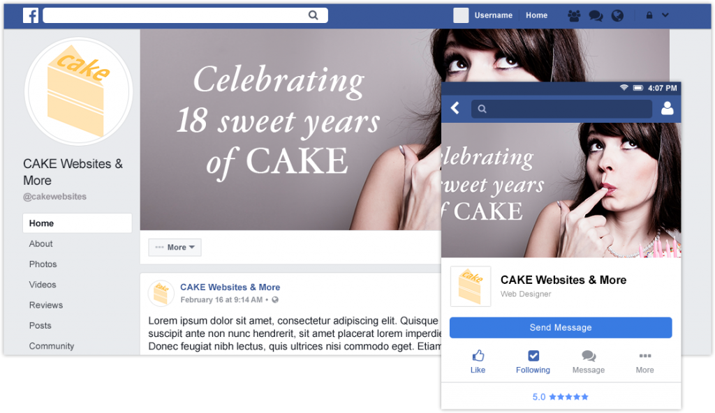
Facebook’s recommended dimensions result in both vertical and horizontal cropping in the mobile view:
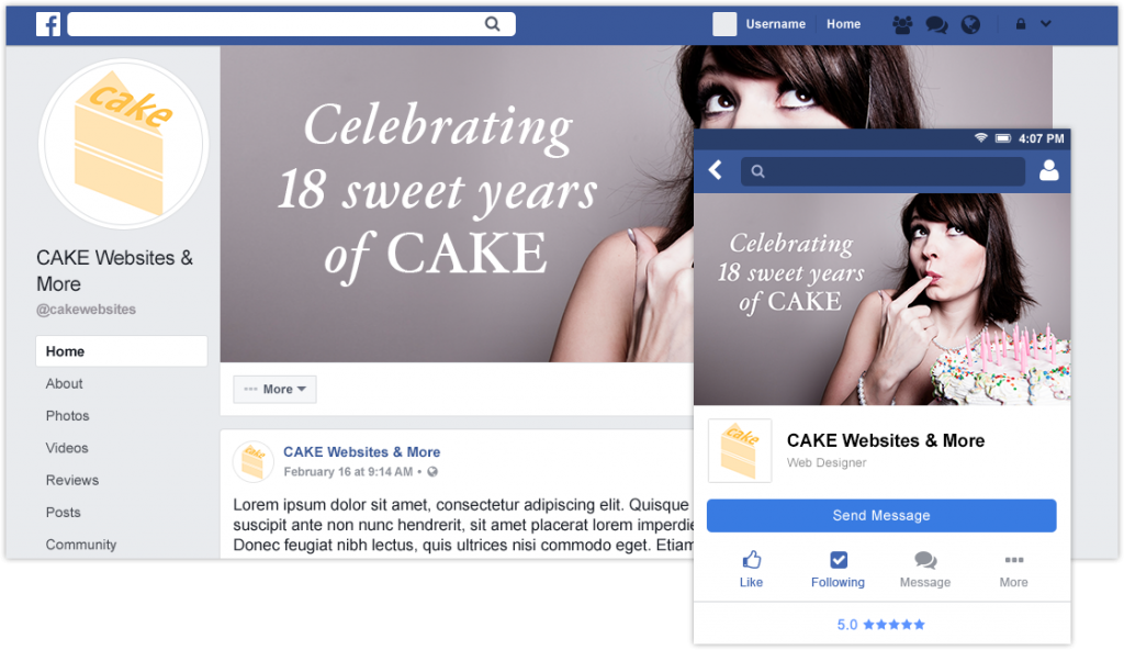
CAKE’s recommended dimensions allow the full image to show in the mobile view:
Wondering how your cover photo and profile picture will convert from desktop to mobile to tablet?
Use these helpful Photoshop documents to test your images before uploading, renaming, deleting, and trying again and again.
Click here to download the PSDs
How to use this file:
- Download the ZIP file and unpackage using your preferred program.
- Once unzipped, you will find two PSBs and one PSD file.
- The PSD shows the cover photo and profile picture cropped to each device.
- Design your cover photo and profile picture using the respective PSB file. (Saving the PSB will automatically update the PSD.)
- When you’re finished with your design, simply save each PSB in a file format you prefer (JPEG, PNG, etc.) and upload to Facebook!
Insider tips for nailing your Facebook images:
- Size matters: Facebook will say 828 x 315 px BUT they’re wrong. Stick to the size mentioned above (828 x 465) and use our helpful Photoshop file to save yourself from a headache.
- Profile picture: Stick with your logo as a PNG if you are a brand. If you are a personality, use a high quality JPEG head shot.
- Cover photograph: Limit the text used and keep it centered. Change it up seasonally to match any large promotions.
- Use PNG to retain graphic quality when necessary: PNG images retain crispness of text and fine lines. We use this format when our profile picture is a logo or when our cover photos have text.
- Use JPEG for photographs: JPEGs offer faster load times (smaller file size) and vibrant colors, making it a great file type for photographs and realistic images that have no text.
Stay tuned, as we will be updating this document regularly when Facebook makes changes. Check back anytime for the latest version here:
www.cakewebsites.com/facebook-page-formatting.zip
We hope it saves you lots of time, headaches, and coffee grounds. You’re welcome!
Originally posted in September 2016. Most recently updated February 2019.


