Typography in Lisbon
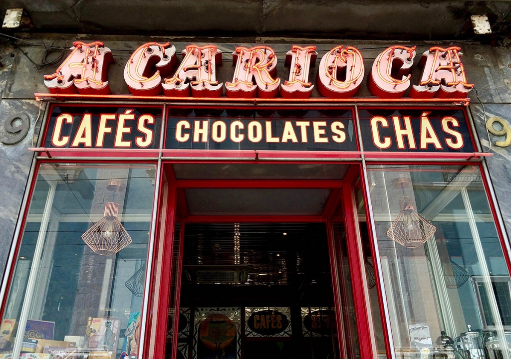
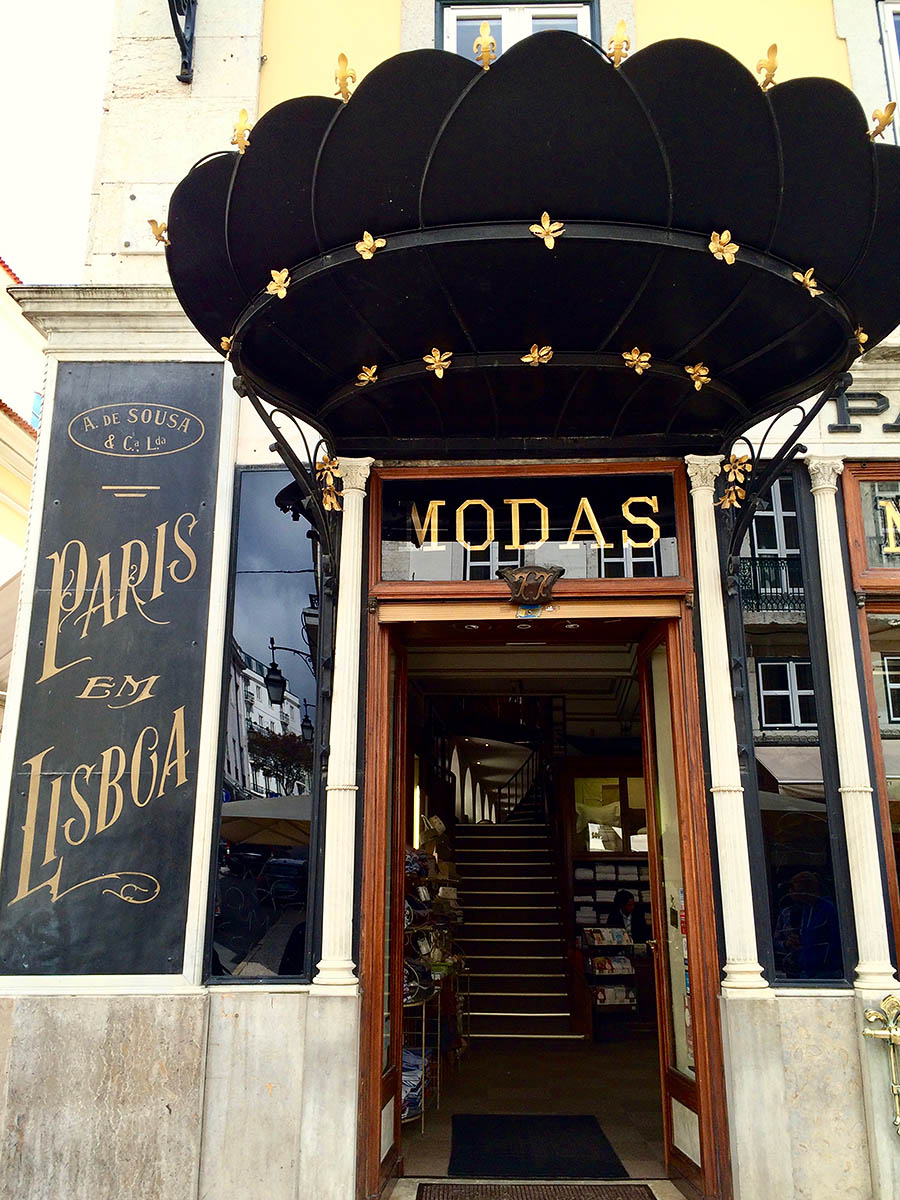
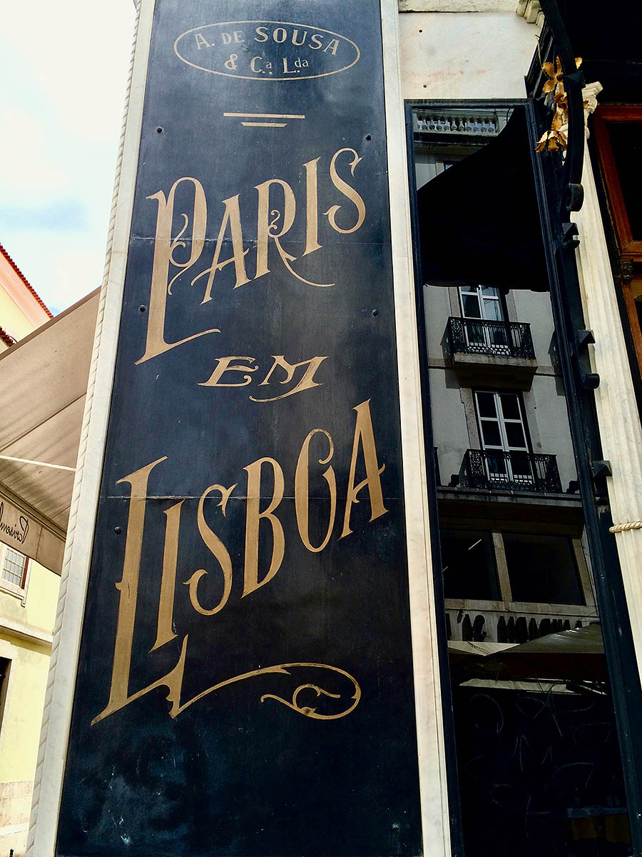
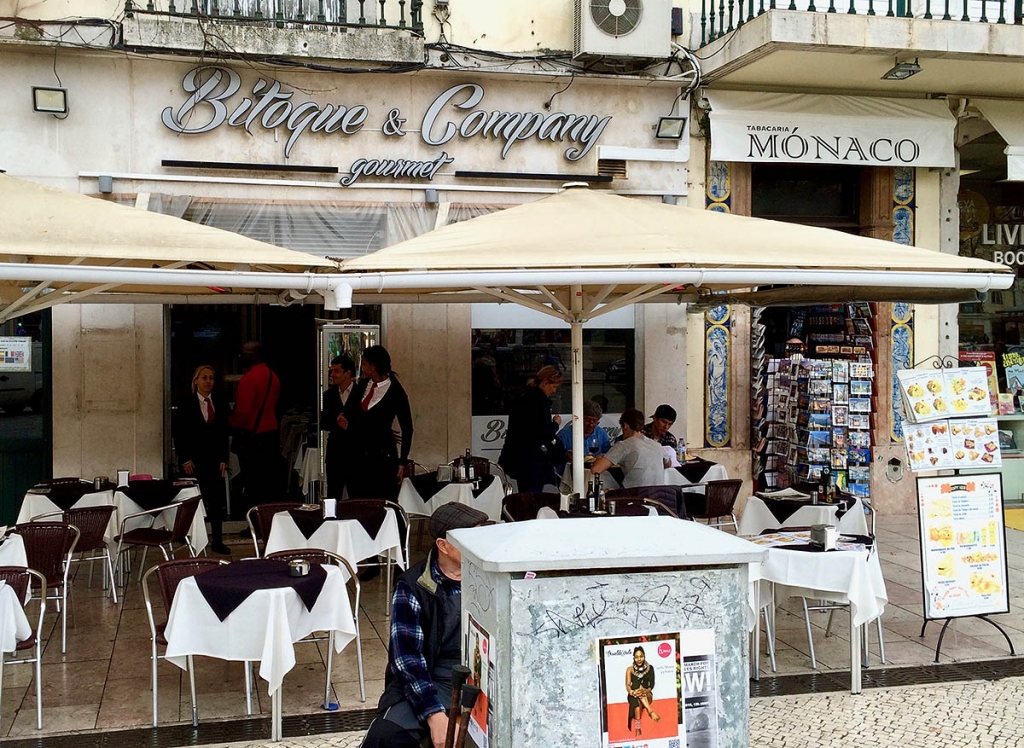
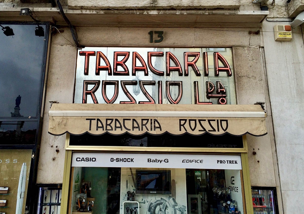
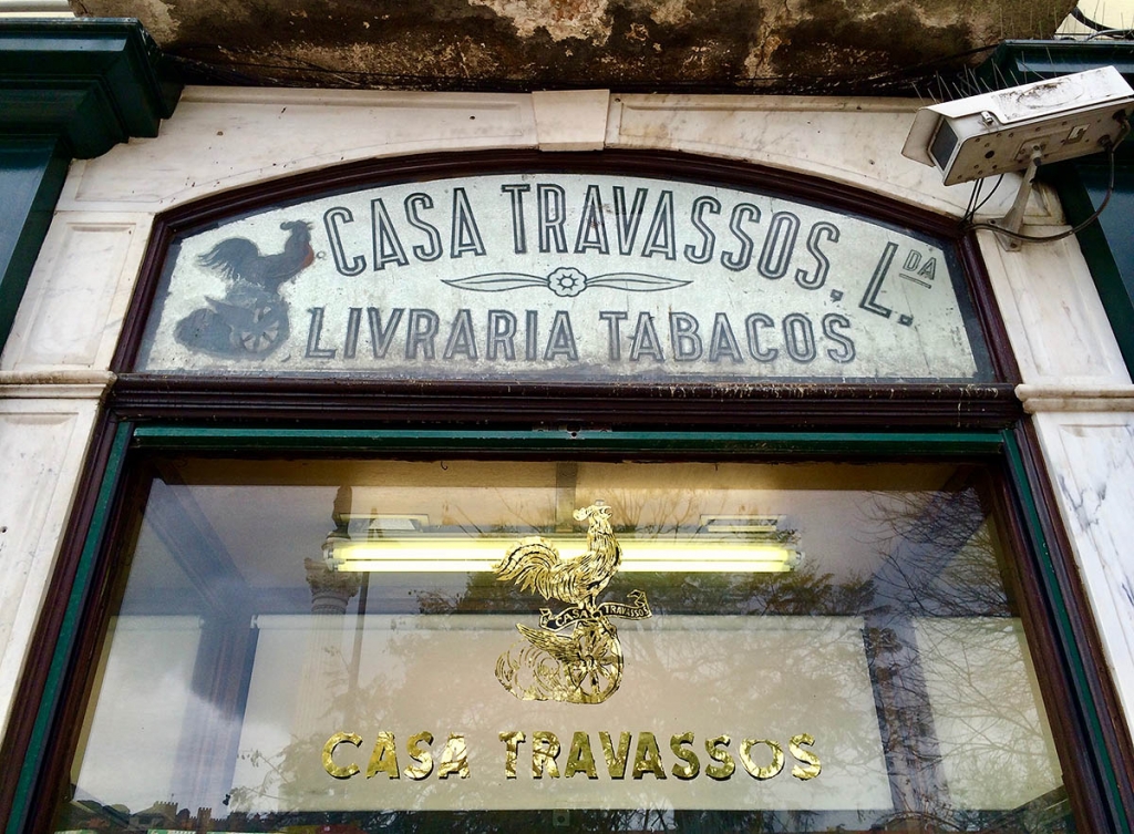
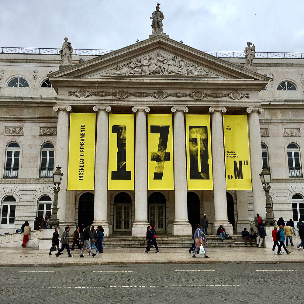
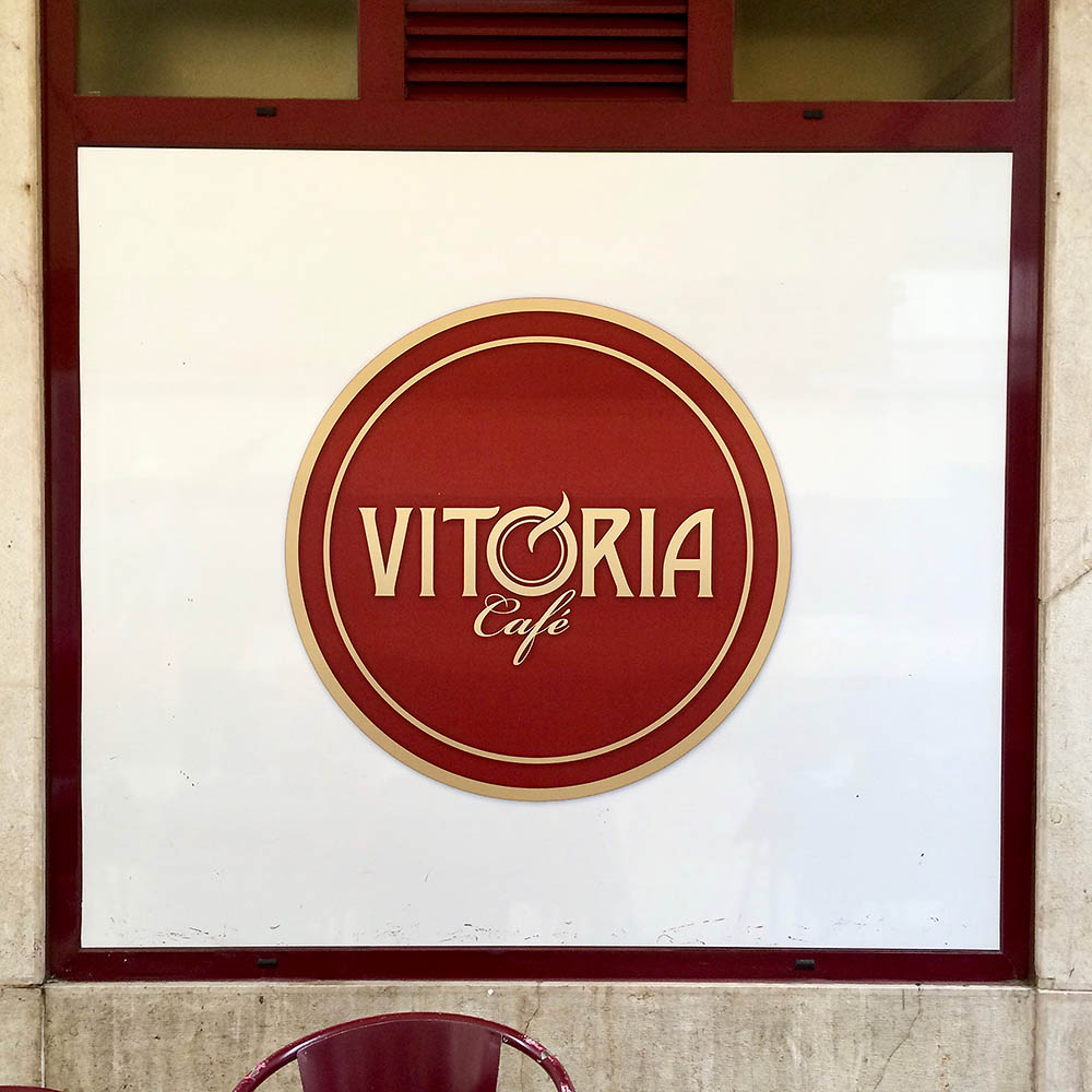
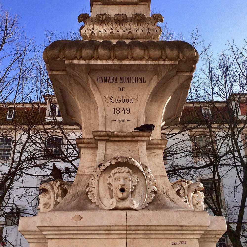
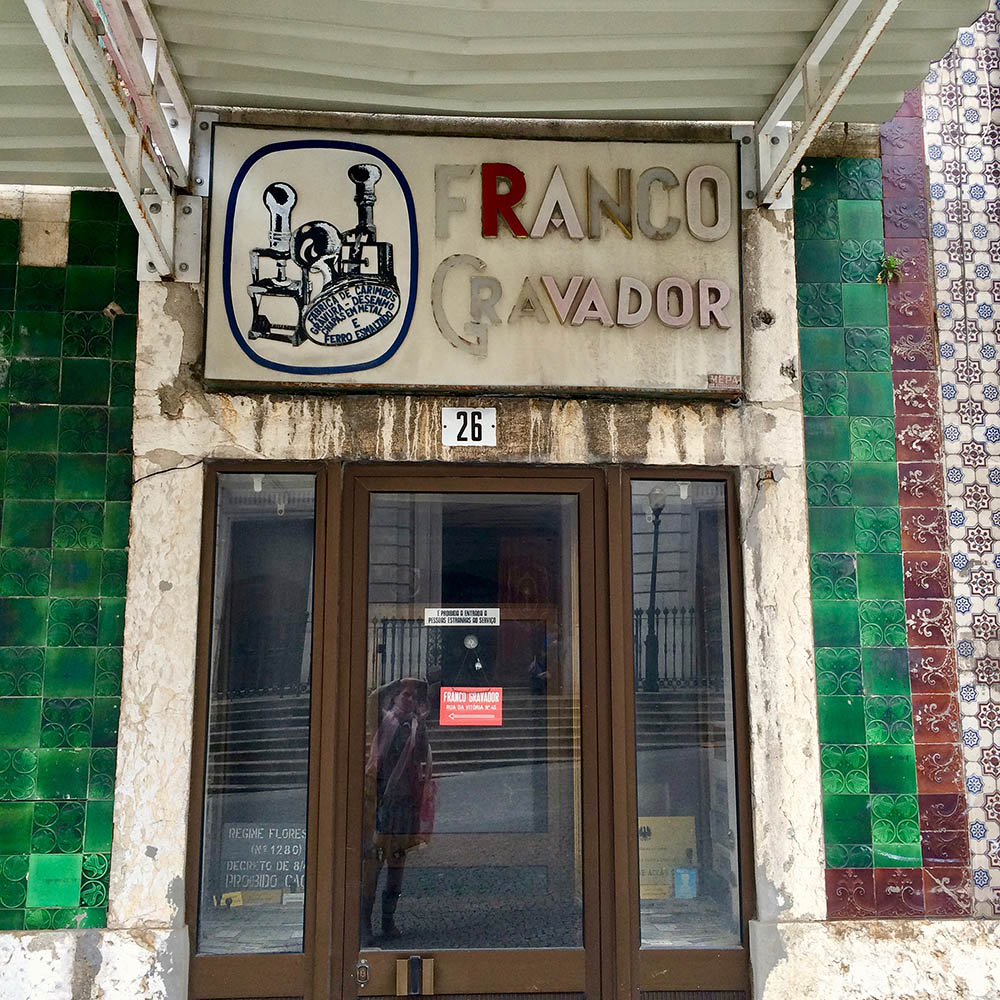
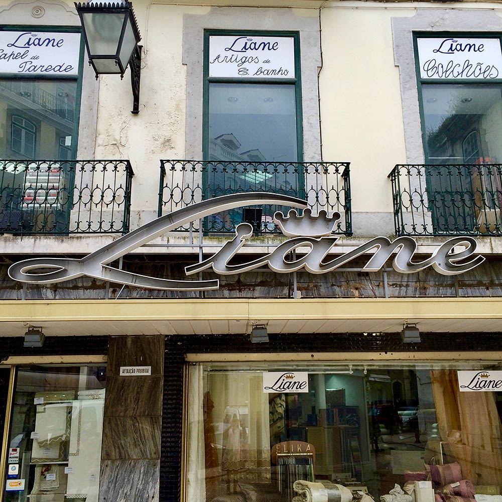
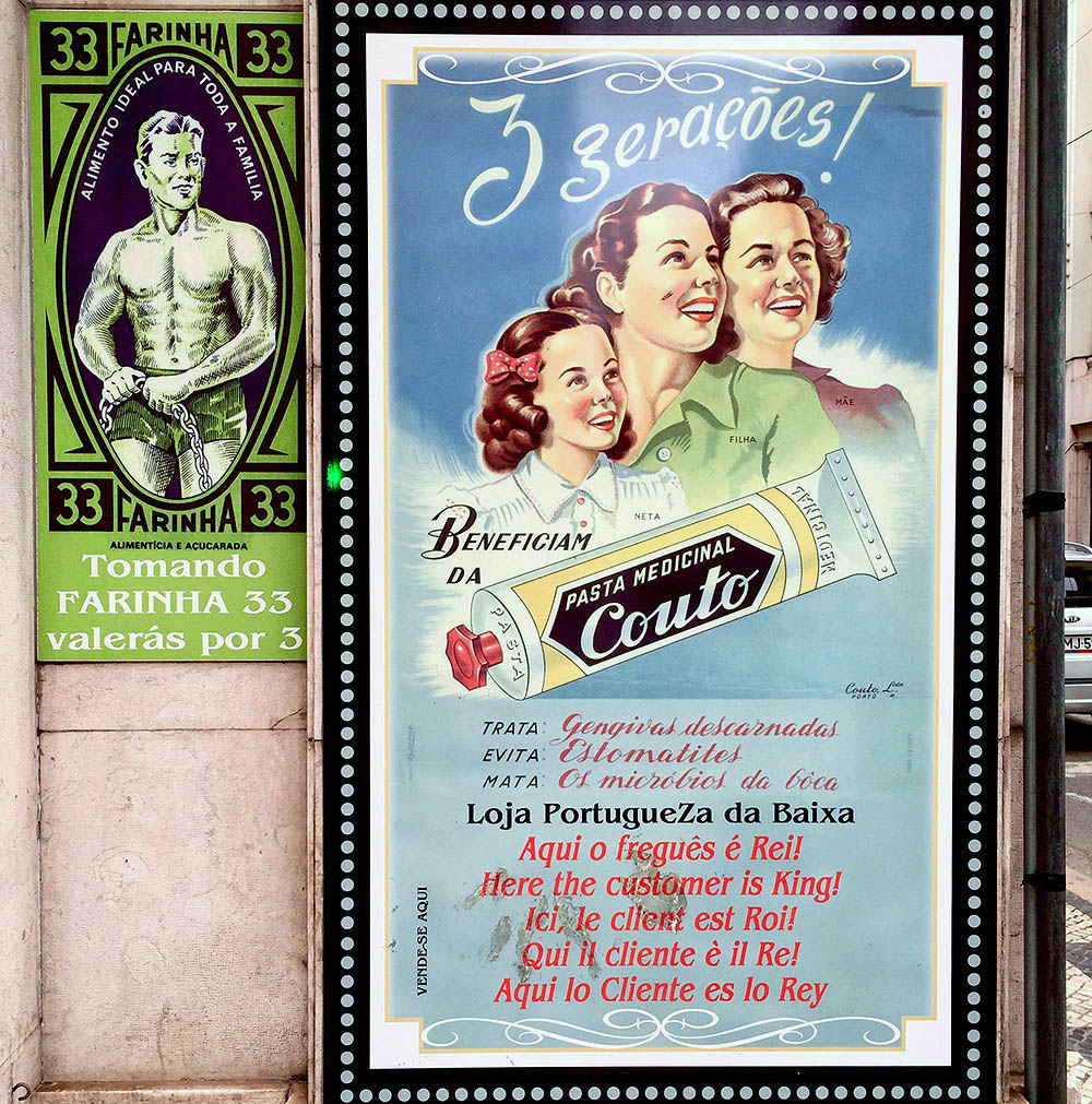
I recently visited Lisbon, having long dreamed of heading to Portugal. Older than Rome (it was settled by the Phoenicians around 1200 BC), it is a city rich with history—and typography. New signage often coexists with older iterations, in curious and delightful combinations. See how many instances you can find of branding updates that were added to storefronts while leaving previous signage intact.
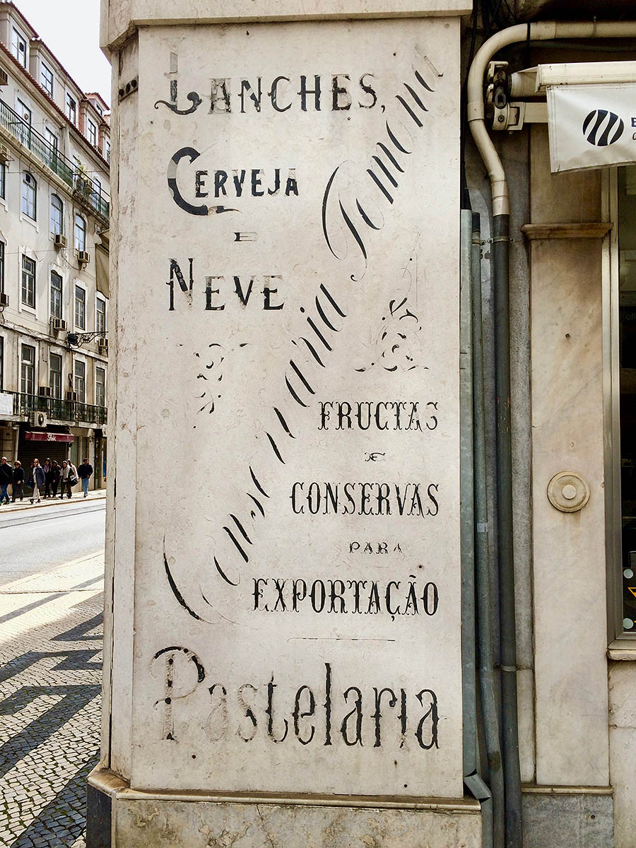
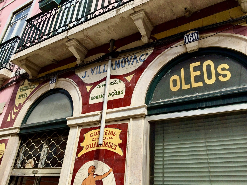
- Love the fading of the finest lines over time. This photo shows off Lisbon’s characteristic palette of subdued pastels, set off with dark, dusky accents.
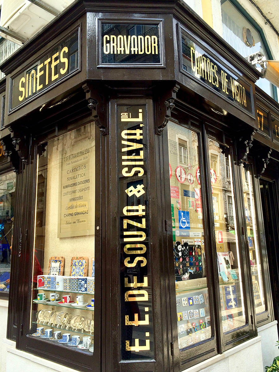
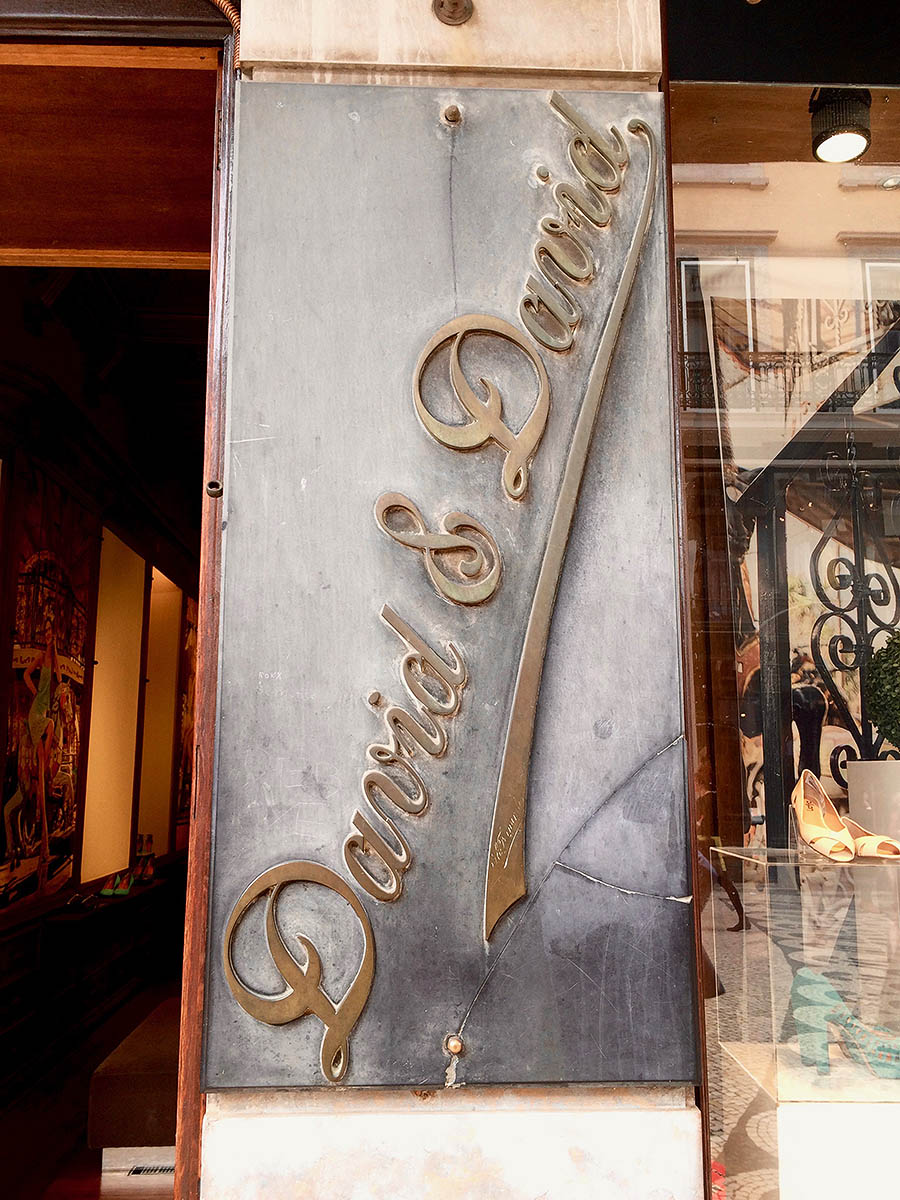
- Classic with a sharp ampersand.
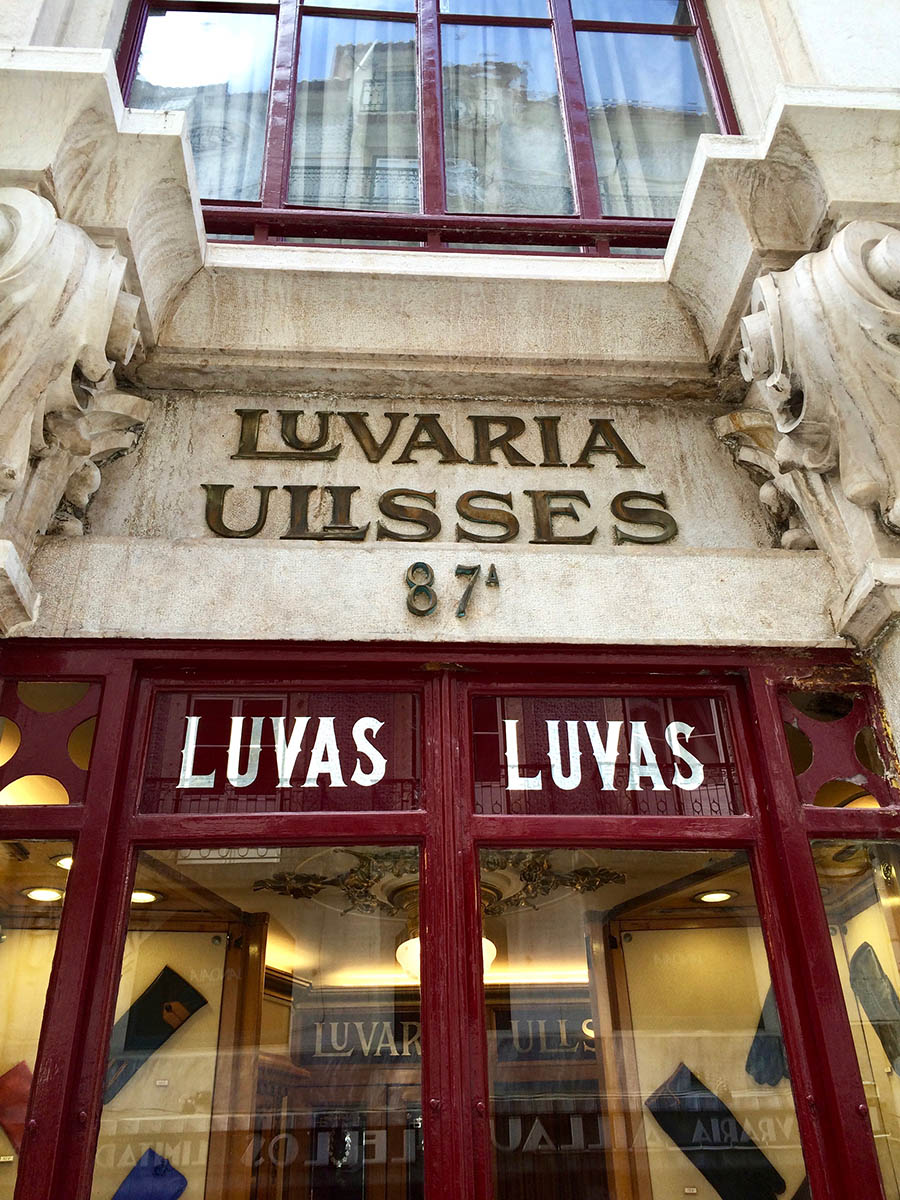
- If you do get to Lisbon, don’t miss this absolutely tiny shop for handmade gloves, Luvaria Ulisses. For scale, look at the display gloves.
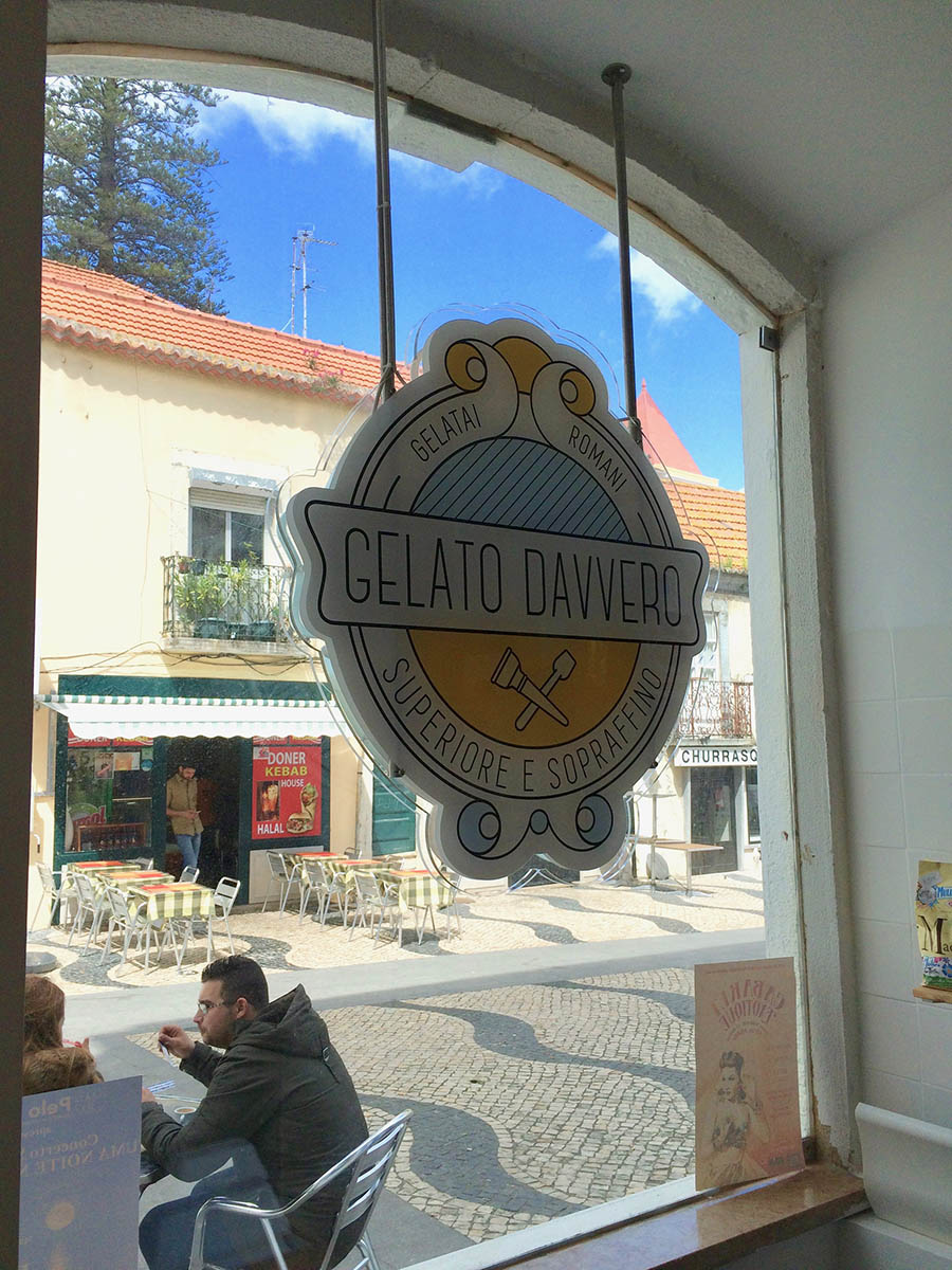
- Hairline type is well-suited to gelato shop branding.
- Sweet script.
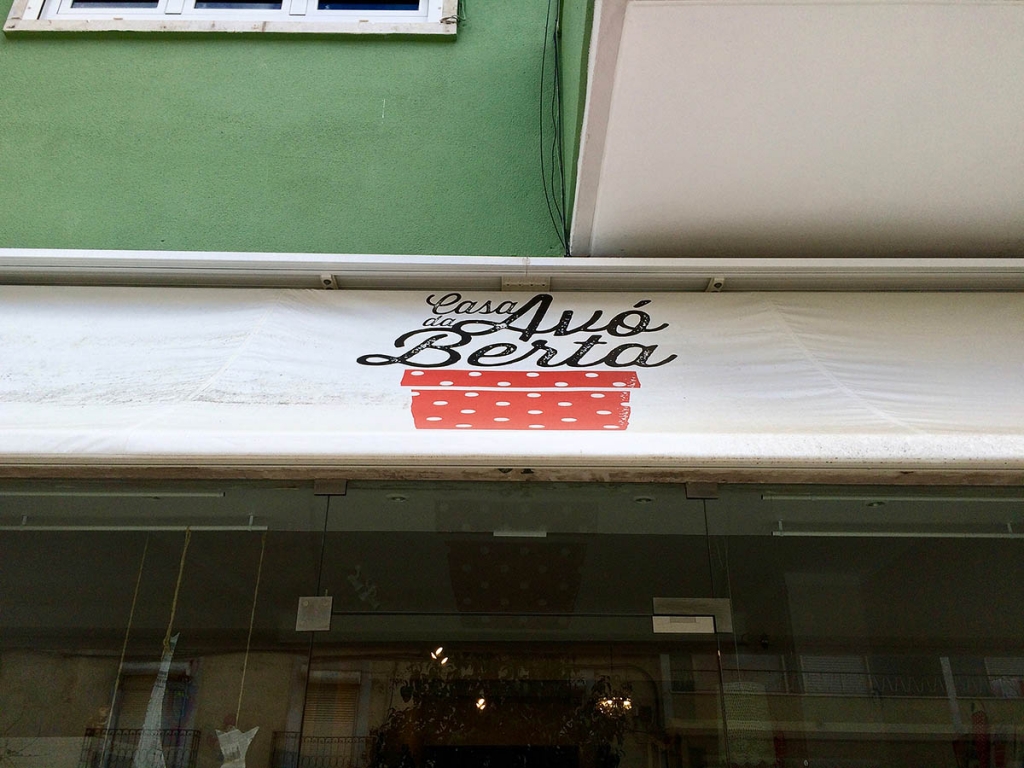
- Nice combo of hand-done brush script and sans serif type.
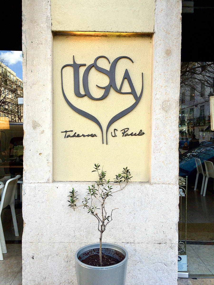
- I like how this little tree reflects the restaurant’s logo.
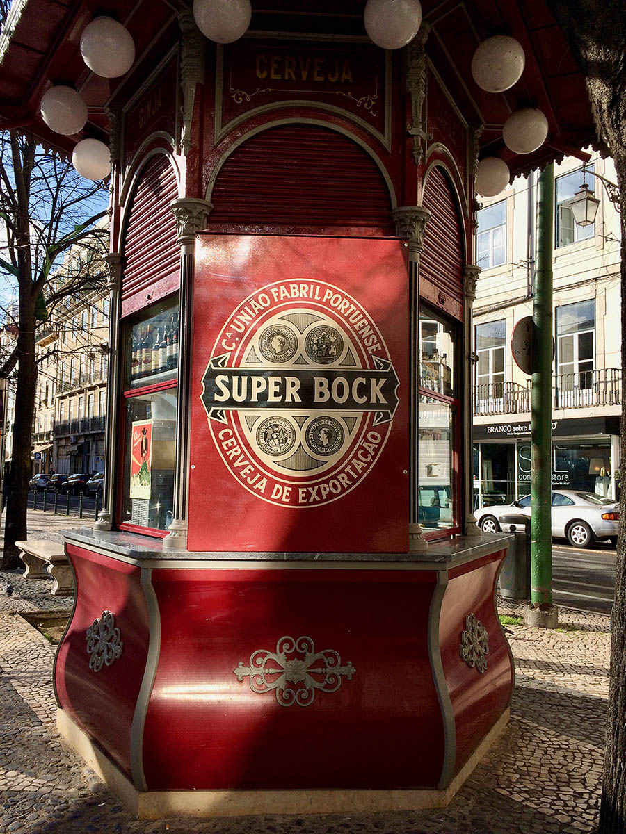
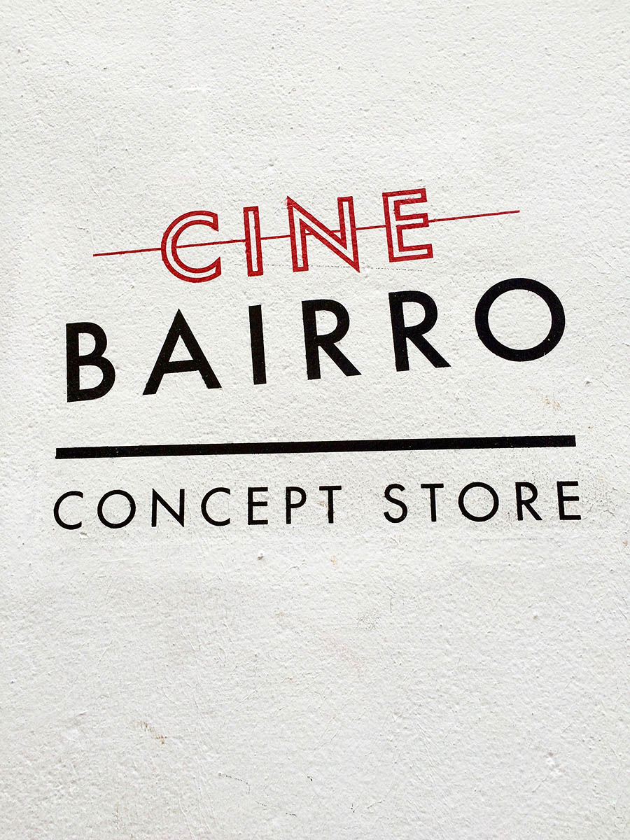
- Red and black: always classic.
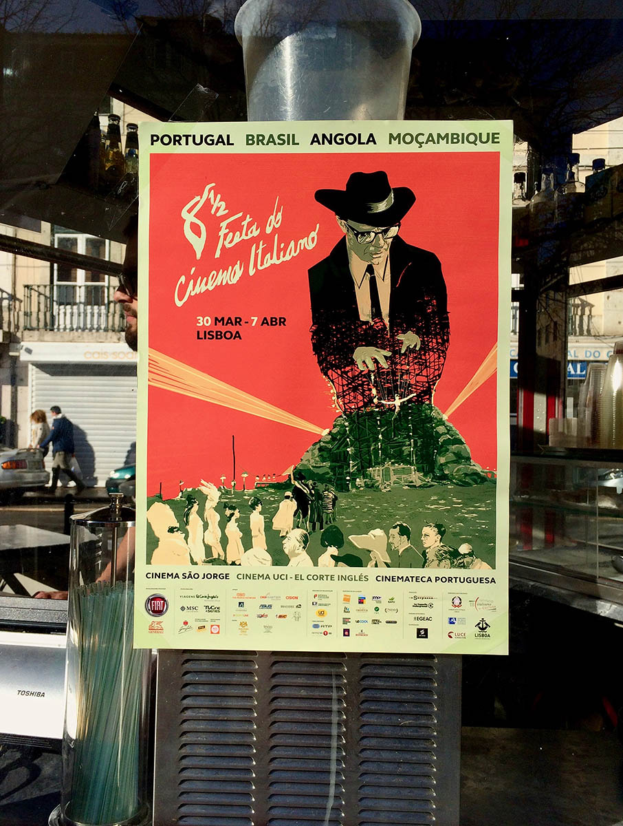
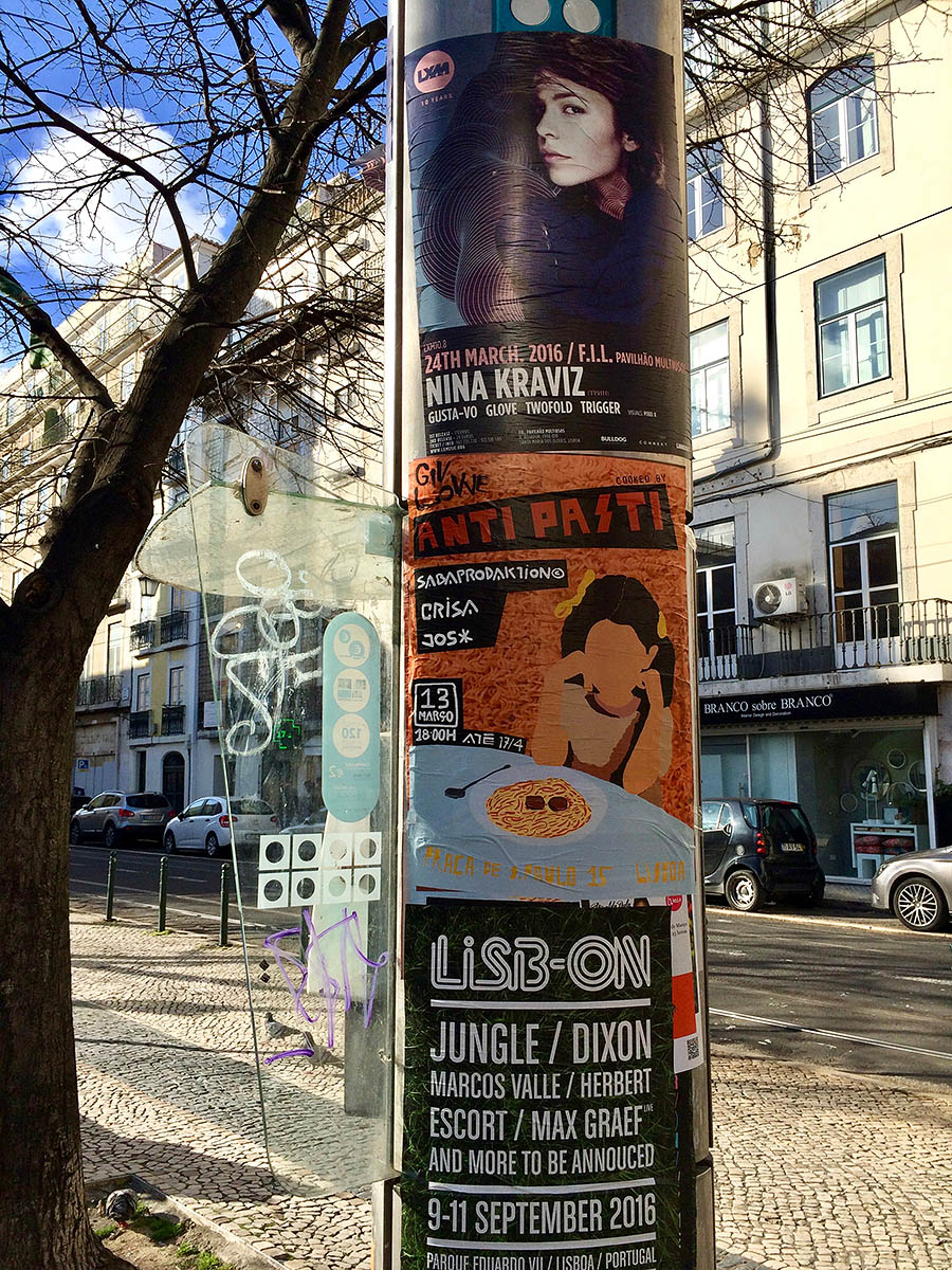
- Creative event advertising.
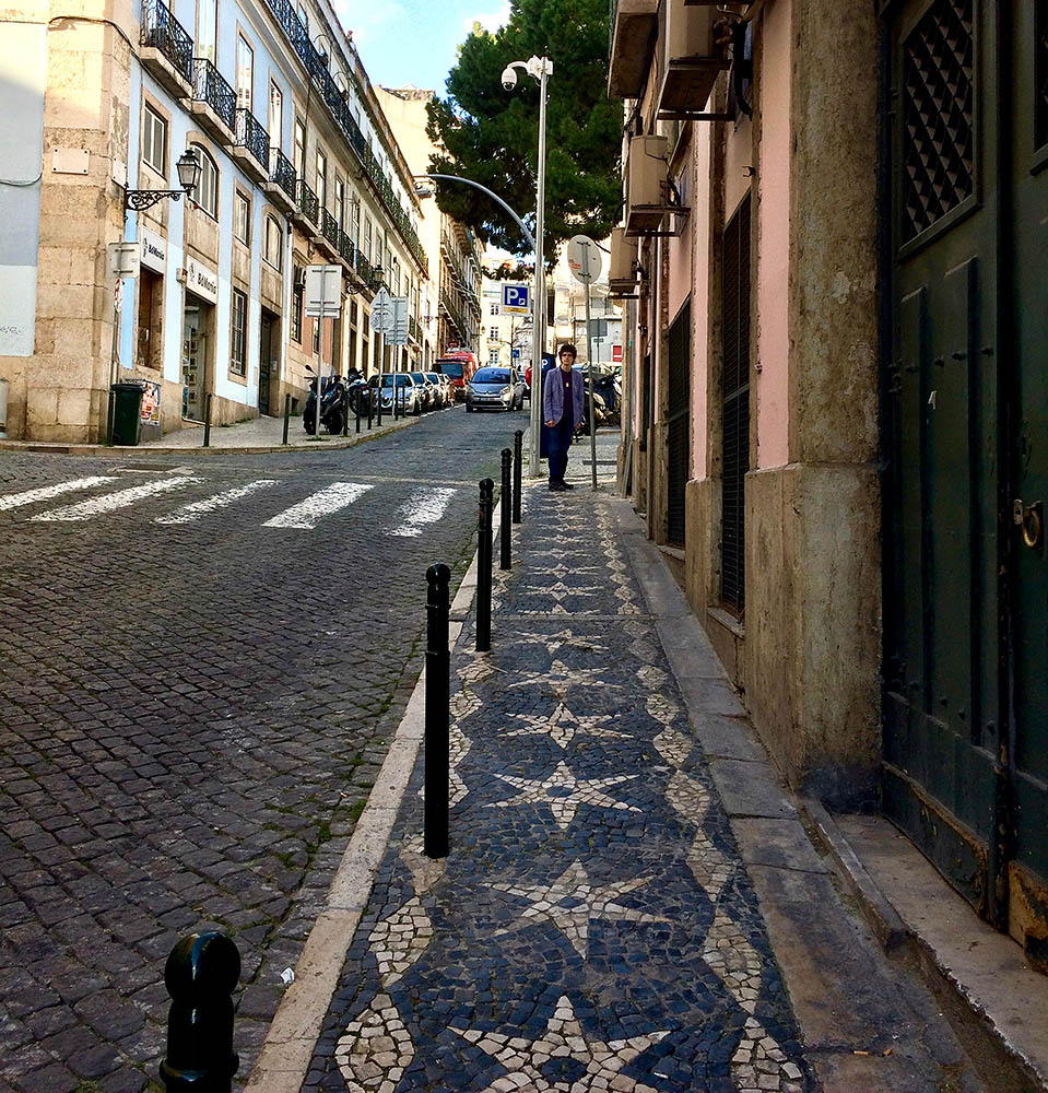
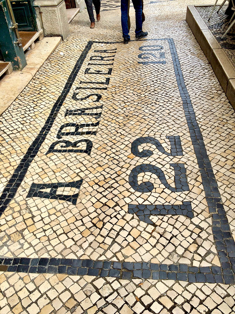
- If you love patterns, put Lisbon on your list. The sidewalks are glorious, but slippery—practical shoes are a must.
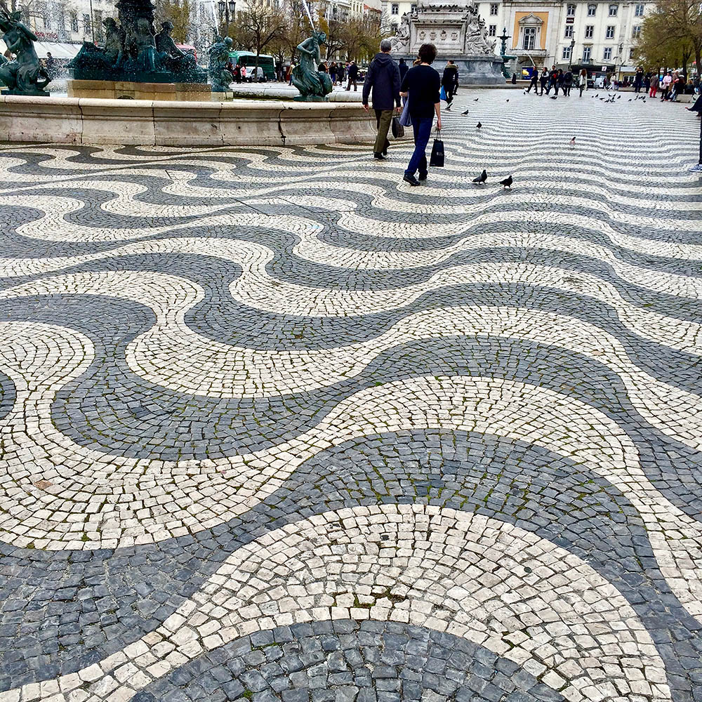
- Making waves with marble.
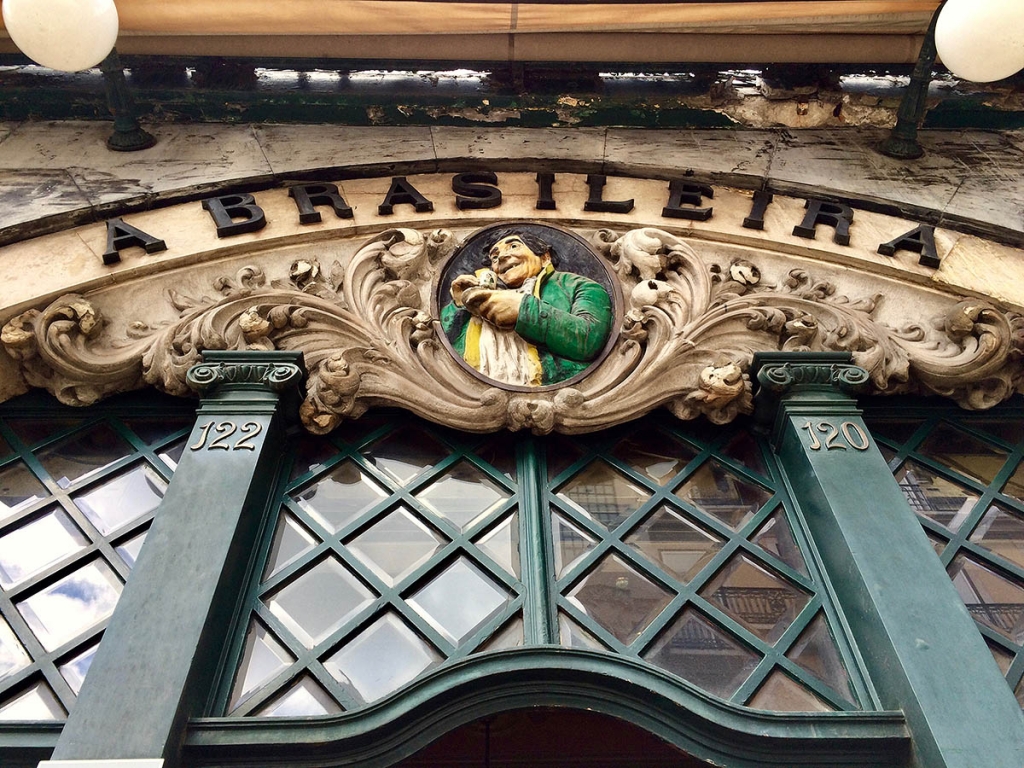
- A Brasileira is the most famous coffee shop in Lisbon.
- …and has been there a long time.
- Fab art deco type.
- How gorgeous is this?
- So gorgeous I had to include it twice.
- Rewards off the beaten path.
- Revolução! Funiculars and garbage trucks are often richly painted with graffiti.
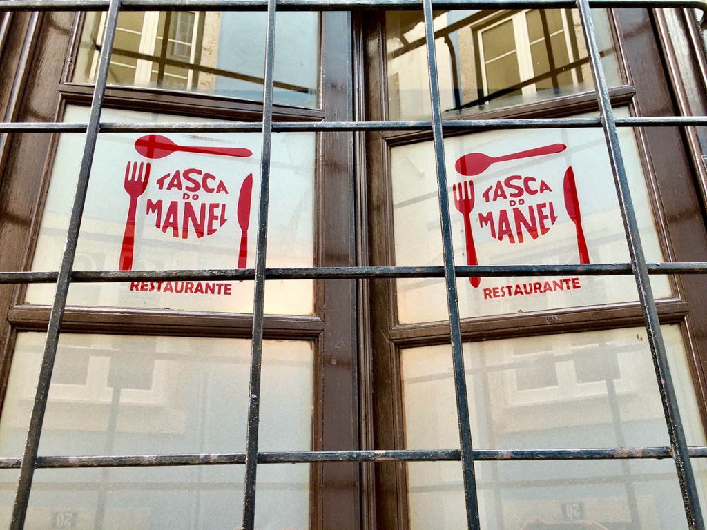
- A charming logo for a restaurant.
- Vendors of modern products like to set themselves apart with modern, pared down design.
- A touch of decadence for a chocolate shop.
- Classic script.
- How rich is that?
- Mmmm, typography.
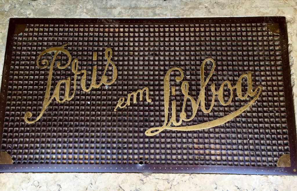
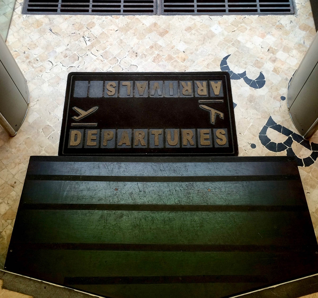
- Even their doormat was perfection.
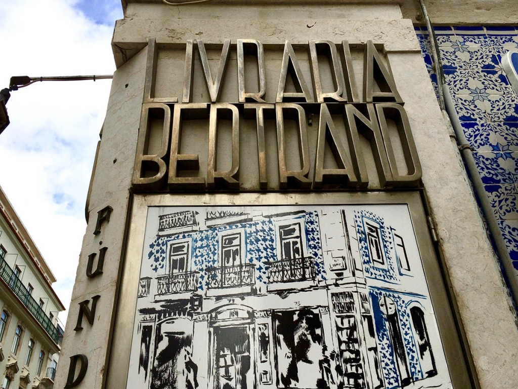
- Livraria Bertrand may be the oldest bookstore in the world; clearly the type is somewhat newer.
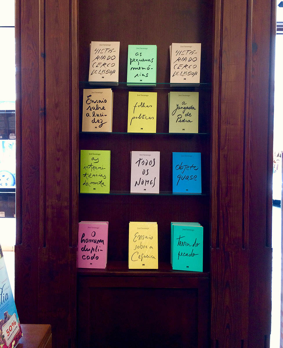
- Inside, a nice collection of script styles for books by Portuguese authors.
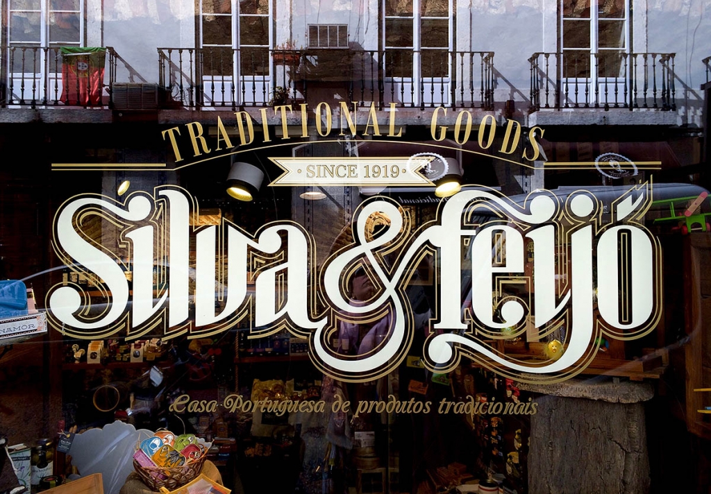
- Love how they set apart the business name with decorative serifs.
- Luscious script.
- Art deco rules, at least in Lisbon.
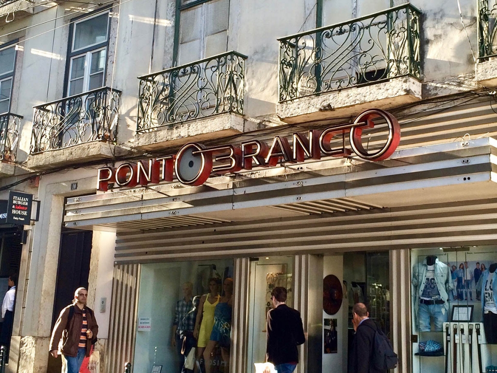
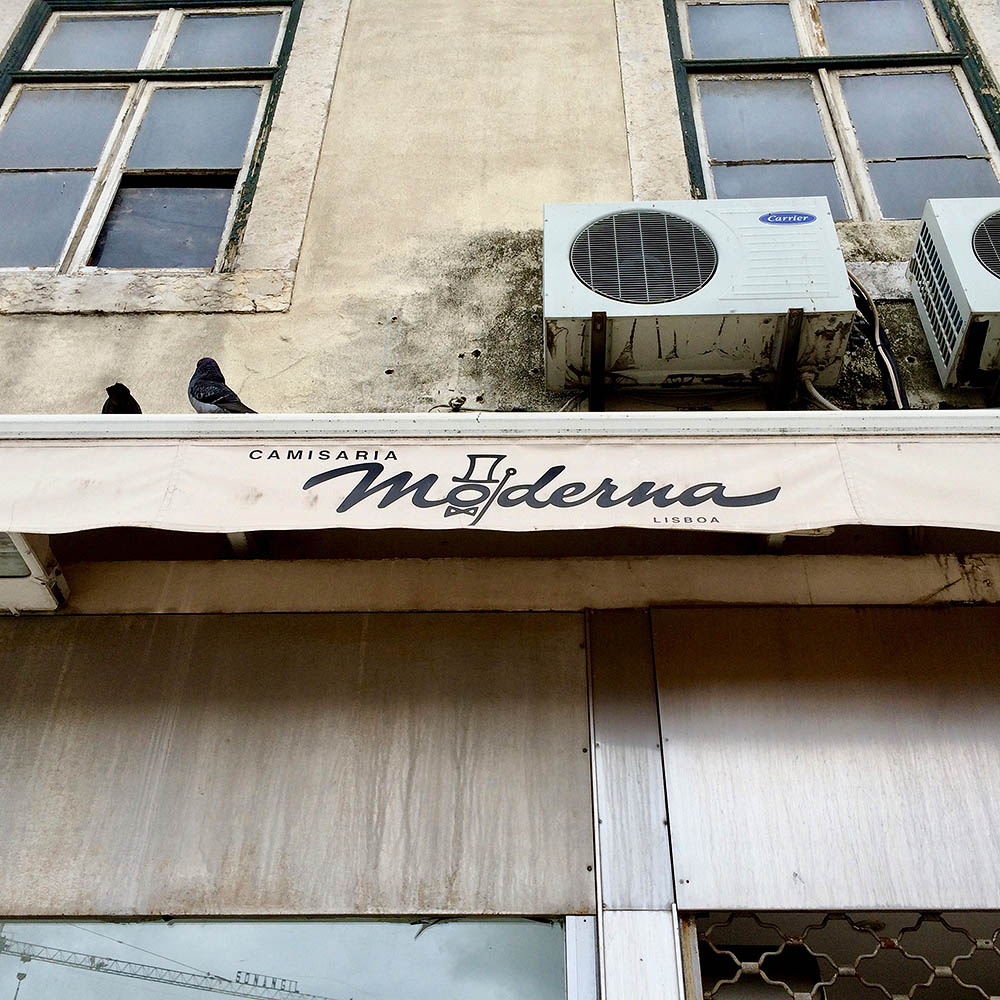
- An nice example of new and old branding coexisting.
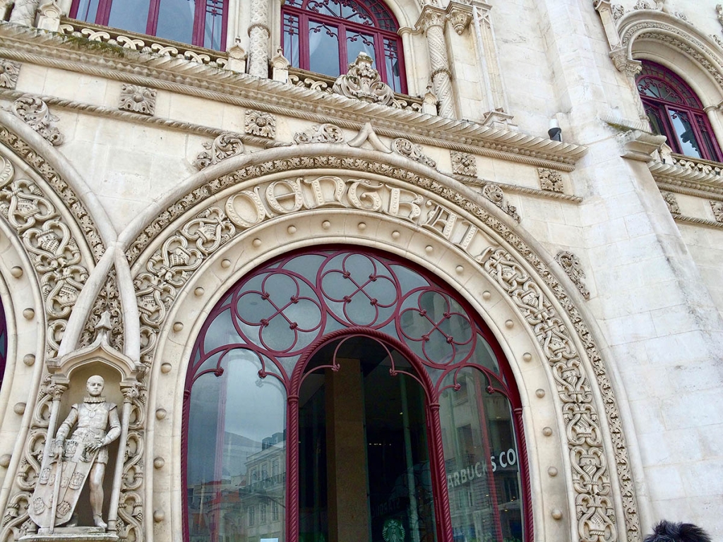
- Rossio station’s stunning facade.
- Images in type.
- I bet this was an interesting shop back in the day.
- They sure love brush script in Lisboa.
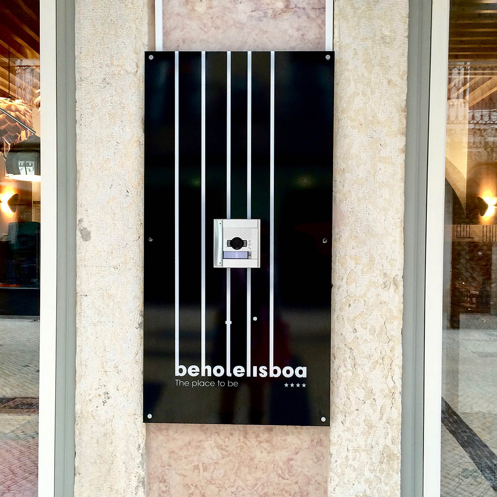
- So close to being so good. Would’ve been perfect had they moved down the cross stroke on the “t” (to make it more clear it is a hotel, and not a hole) and aligned the dot for the “i” with it.
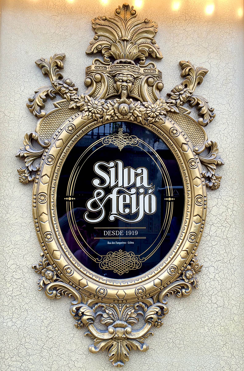
- A classy restaurant logo.
- Nice blackletter with flourishes for Lisboa.
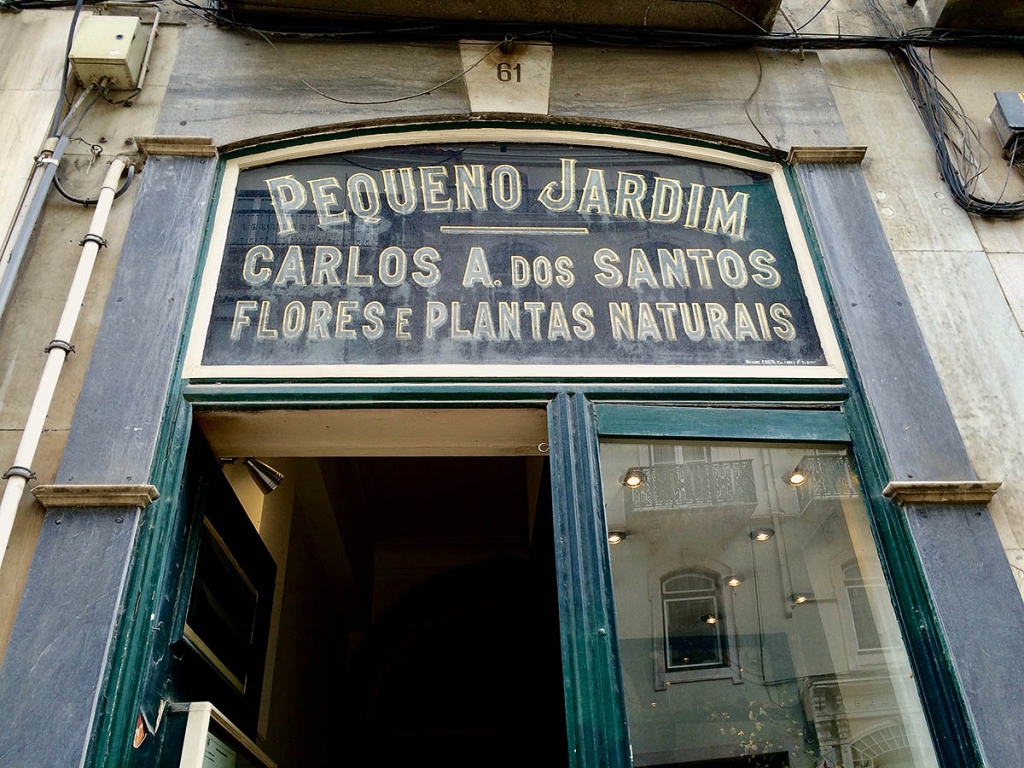
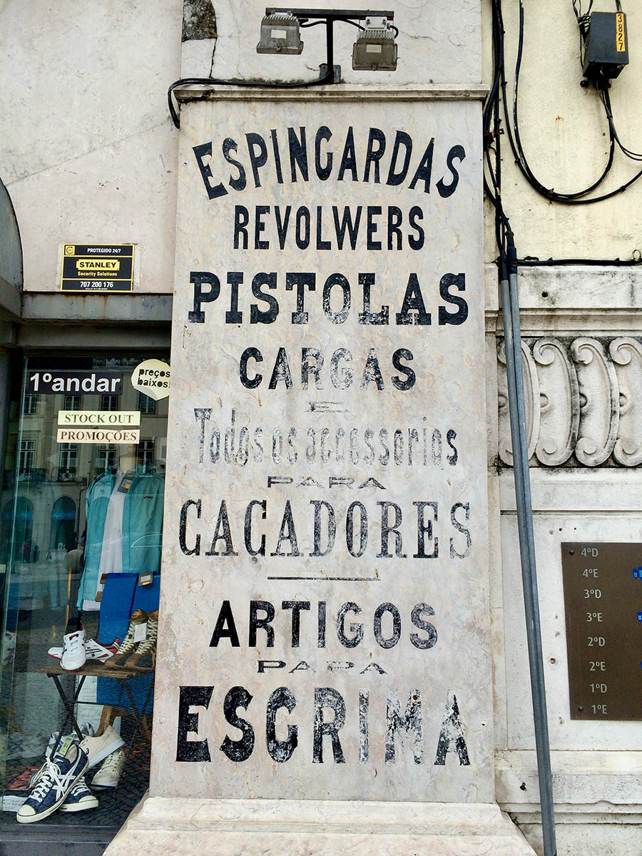
- Lots of inspiration in decaying signs.
- Kinda sweet how they let an amateur paint the various signs, though it gets a little disturbing on the rightmost one.
- I could not figure out if these were newly made to look vintage or what. If anyone reading this knows, do tell in the comments.
- Tchau!
Would love to hear of your favorite spots in Lisbon here in the comments!
All photos were taken in March 2016 on my iPhone 5.
